Thomas P. Kausel
Ordered Colours
Thomas Kausel’s artistic programme could be described as an unconditional return of painting to pure, unadulterated colour. His theoretically motivated approach focuses less on the expressive values of colour than on its material substance and its principles of order. The scientific meticulousness with which Kausel pursues this programme is reminiscent of the longing for a radical objectification of art that was continually formulated in the 20th century and which particularly characterised concrete art. Ultimately, however, the free painterly treatment of objectified means of design points to the artistic qualities of a painting that eludes its complete objectification.
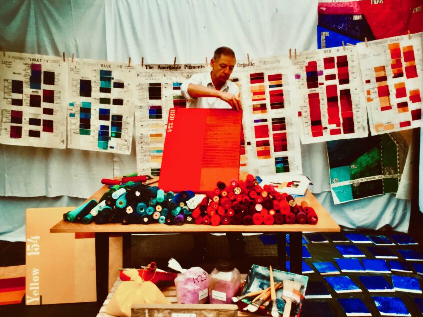
With the Colour Index (C.I.), published since 1971, Kausel has at his disposal a set of instruments that classifies the approximately 600 colour pigments available worldwide, of which almost 200 are particularly suitable for painting because of their high lightfastness, and assigns them an internationally binding code of letters and numbers. Unlike in physical classification systems such as Newton’s colour wheel, the colours are not grouped here according to the wavelength of the reflected light and thus according to their appearance, but on the basis of the molecular structure of their pigments. Thus, even those pigments that are not considered related at all according to our conventional ideas nevertheless belong to the same chemical group. Thomas Kausel uses exclusively unmixed colours for his works, which are obtained from the pigments listed in the C.I..
His installation 6 rote Stelen (6 red steles) consists of six wooden beams, the mounts of which materialise just as many different pure red pigments in space, as it were.
The two-part canvas works such as Blue B 60 (Anthraquinone) and the three other organic blues each combine only colours of one group. Kausel starts with a freely chosen pigment, which he presents on the one hand as a monochrome picture and on the other hand combines with other colours to form a geometric composition. Since the chemical classification does not correspond to our colour perception at all, many of these compositions appear surprising and sometimes even daring. Thus Kausel, whose work is in the Enlightenment tradition of Josef Albers’ oeuvre, breaks our usual thinking in terms of well-tried colour schemes and harmonies and forces a new look at a seemingly familiar phenomenon.
By using a standardised system of order as the basis of his method, Kausel lends his works a scientific foundation that does not, however, appear in the final form of the picture. For the C.I. in each case only defines the area from which the colours used are taken. The final choice is made freely and intuitively by the artist, who is guided by his own artistic ideas and creative principles. Even the arrangements of the surfaces and the different ways of applying the paint do not follow a fixed scheme and thus do not show an objectified language of form. While some surfaces are of an almost impersonal smoothness, others are designed as dynamic
gestural painting or are given a strong structure emphasising the materiality of the paint through the use of combs.
Other qualities of the applied colours become visible through their different densities, which result from the number of layers of paint laid on top of each other. For example, the same blue can appear in different brightness on two panels that belong together. These creative strategies, which counteract the repeatedly formulated ideals of Concrete Art of absolute clarity and regularity, are supported by the application of the respective chemical codes to individual colour fields. For by repeatedly twisting letters and not designating all the surfaces, Kausel denies these inscriptions, despite their objective appearance, the function of a neutral instrument in the sense of a scientific coding of what is seen.
Kausel’s painterly oeuvre appears like a scientific series of experiments that gradually systematically examines all the pigments of the C.I. and thus fundamental conditions of painting. But for Kausel, the tension between the objectifiable conditions of the painting, i.e. the colour distributions, and the finished painting as artistic production is always of decisive importance. Thus, although he poses a fundamental question about the role of painting with “Is painting becoming superfluous?”, he unequivocally denies this with his painterly work. The diptych shows the exact areas and colour distributions of blue B 60 (anthraquinone) and the three other organic blues with dividing lines and chemical designations. Like a score, it contains all the clearly communicable factors that are necessary for the production of these images. Unlike other works, however, which juxtapose the general designation of a colour with its painterly expression and thus emphasise the universal significance of the linguistic expression, Kausel’s juxtaposition reveals the specific aesthetic, emotional and – this interpretation is also open to the viewer – symbolic qualities that elevate the executed painting as a work of art above its pure structure and chemically comprehensible substance. Yet, for Kausel, the craftsmanship of the executing artist is crucial to the effect of his painterly etudes, which, while consisting of rationally determinable elements, nonetheless allow for non-rational, aesthetic experiences.
Text: Rasmus Kleine
Tobias Hoffmann Museum Director
Novel?
Recognisable?
Unique selling point?
Three things are characteristic of Kausel’s painting:
He shows
1. the 149 pure, unmixed pigments; they have a stronger
have a stronger optical effect than mixed, cloudy
colours,
2. sometimes written into the picture: the internationally
binding name of the pigment, such as “Blue 28”,
according to the Colour Index System C.I. – it does not classify
not according to the appearance like usual colour circles,
but according to the chemical structure: Blue 28
is cobalt blue. And
3. if in multicoloured works all pigments are chemically
are chemically related (e.g. only cobalt pigments),
unusual “interactions of colour” (Josef Albers) arise.
(Josef Albers) such as Cobalt Yellow Y40 next to
a “luminous” Co-violet V49 or
the saturated Co-blue B 28.
Structures and colours show an incomparable beauty. With thickly applied paint, structures and surface treatment, Kausel creates a strong luminosity of colour and the work gains energy and captivates the viewer.
Radiant colours generate joie de vivre, cheerfulness, love, vitality, confidence, sociability and self-assurance.
The works are mood-lifting, stimulating and symbolise invigoration, cheerfulness and positive thinking. Kausel’s works are in numerous important public collections, including the Hamburger Kunsthalle,
British Museum London, Mobile Museum of Art, Mobile, AL/USA, University of Arizona Museum of Art, Tucson/USA, University of Michigan Museum of Art, UMMA, Ann Arbor MI/USA, The Nelson-Atkins Museum of Art, Kansas City/USA, New Orleans Museum of Art, NOMA, New Orleans, LA/USA Kausel experiments with colours, forms, lines, surfaces and their interactions.
Abstract expressionism, colour field painting, monochrome painting, concrete art, concrete painting,action painting, meditative colour field painting, colour fields, art concrete, concrete art, painting concrete, painting concrete,
concrete painting, hard edge.
The power of pure, unmixed colour
The paintings of Thomas P. Kausel
The Berlin painter Thomas P. Kausel, who lives in Munich, shows with his Concrete
– which means: not depicting – painting the elementary colour substance; that is: pigment
with a binder – such as linseed oil or acrylic. Typical for Kausel – and only for him – are three things
is threefold:
Firstly, he works only with 154 pure, unmixed pigments of the highest light-fastness.
because the intensity (“colourfulness”) of pure colour is higher than that of mixed colours: pure
colours: purer is stronger! “What is the bluest blue? – how red can red be?”
This is what his works answer. Kausel makes colour as a substance sensually (visually,
haptically): on the “stage” of wood, paper and canvas, the colour substances present themselves
substances are presented on the “stage” of wood, paper and canvas: thinly applied transparently or thickly applied with a rough
surface or with a high-gloss lacquer finish.
The second special feature: inscribed words and numbers, such as “Blue 28” –
are the official international names of the respective pigment. These names originate
from the globally binding industrial Colour Index (C.I.) system.
is the only one that does not classify pigments and dyes according to their appearance like all the
colour circles since Newton, Goethe etc., but according to their chemical structure:
Blue 28 is the name of the colour pigment cobalt blue.
And thirdly: multi-coloured “colour chords” often consist of chemically related pigments,
neighbouring pigments, which makes some colour combinations seem surprising and sometimes even
and sometimes even daring, for instance when a brown pigment appears next to a blue one in a picture
system, a brown iron oxide is next to a dark blue one. Or
three red canvases entitled “Red 254” and “Red 255” show the organic colour substance “Aminoketon”.
organic colour substance “amino ketone”. The title of one group of works – “Unusual Interaction of
Colors” – refers explicitly to Josef Albers, the Bauhaus teacher from Bottrop who became famous in the USA.
Bauhaus teacher from Bottrop.
Kausel started with landscapes, later abstract works (blatant examples:
Aktions-Malerei, created in 1991 with Hermann Nitsch – Kausel’s way), finally
he paints concretely.
Kausel, born in Berlin in 1937 and living in Munich, was a photographer and cameraman.
studied painting in Salzburg with Vedova, Chia, Dias, with Nitsch as a master student
as a master student and with G.K. Pfahler as an assistant. Works by Kausel can be found
in the Von der Heydt-Museum Wuppertal, the Sprengel Museum Hanover, the Hamburger
Kunsthalle, Wilhelm-Hack-Museum Ludwigshafen, Berlinische Galerie Berlin,
British Museum London, etc.
Three-dimensional works. An object with energy. Kausel is one of the internationally renowned contemporary artists worldwide with market value. The recognition of Kausel’s work by the professional world is demonstrated by the inclusion of Kausel’s works in over 150 museums and art collections and by solo and group exhibitions in renowned international museums such as the Musée d’Art Moderne et FRAC Minidi-Pyrénées Toulose, Mitttelrhein Museum Koblenz, Staatliche Kunstsammlungen Dresden, Kommunale Galerie Berlin, Muzeum Ziemi Chelmskiej Museum für konkrete Kunst Ingolstadt, Museum MUSA der Stadt Wien, The Nelson-Atkins Museum of Art, Kansas City/USA, Wilhelm-Hack-Museum, Ludwigshafen, Kunstsammlung Jena, Städtische Museen Jena, British Museum London.
Opinions (press etc.) about the work of Thomas P. Kausel :
The German painter Thomas P. Kausel, whose “Concrete Painting”
achieves fascinating results with unmixed pigments. SMALL NEWSPAPER, GRAZ
He does not tell a story (n) in his works, but he shows colour as colour
for its own sake . CITY MUSEUM BERGKAMEN
Kausel is an elementary artist who wants to “make things visible that exist independently of man”.
exist independently of man”. ART ASSOCIATION SALZGITTER
Concrete painting means only itself, it merely refers to the concrete elements of painting.
elements of painting, which are: the room, the wall, the canvas and the paper.
the paper, the colour substance. ART FORUM ARABELLAPARK
Truly colourful “Concrete Art” by the Munich painter Thomas P. Kausel can be seen in the
St. Ingbert town hall. SAARBRÜCKER NEWSPAPER
The bluest blue, the reddest red, the greenest green; colour in its purest form:
Exhibition of unusual works by Thomas P. Kausel in the Bürgerhausgalerie.
SCHWABACHER TAGBLATT
Pure colour, rich and sensual. GENERAL ANZEIGER
The beauty of unmixed colour. SIEGENER RUNDSCHAU
The celebration of pure colour. SOESTER ANZEIGER
The use of pure pigments allows the colours to shine unadulterated. CITY-
MUSEUM BERGKAMEN
Kausel wants to explore the colour pigments, let them shine unclouded and interact across the canvas.
interaction across the board. WESTFÄLISCHER ANZEIGER
Thomas P. Kausel is currently showing colour in its purest form – that is, unmixed – in the
Stolberg Castle Gallery. SUPER WEDNESDAY
What does the bluest blue look like? DONAU COURIER
The whitest white, the reddest red – colour as colour: Thomas P. Kausel. FRANKENPOST
Cual es el azul mas azul? (What is the bluest blue?) EL SUR / CHILE
Kausel’s mostly monochrome works are created from pure, i.e. unmixed, pigments.
Often the name of the colour, the pigment code from the colour index (which determines each
colour substance according to its chemical structure) is applied. Each colour substance is thus bindingly defined in terms of its specific properties via the code and can be sensually experienced as a colour.
MUSEUM OF CONCRETE ART, INGOLSTADT
Painting with unmixed pigments brings: a surprising, astonishing material-
quality. OBERFRANKEN PRESSE, FRANKENPOST
Pure colour, rich and sensual. GENERAL ANZEIGER
For Thomas Kausel, only pigments that are highly lightfast are of interest,
so-called “high performance pigments”. ART ASSOCIATION SALZGITTER
Thomas Kausel’s work is independent and substantial, elementary and sensual at the same time.
sensual at the same time. KUNSTVEREIN SALZGITTER
Kausel – that is quite simply art that is sensual and appeals to the senses. ART FORUM
ARABELLA PARK, MUNICH
In his painting, Kausel was and is primarily concerned with the quality of the material, in essence with colour.
the colour. ART ASSOCIATION HOCHRHEIN
Colour saturated and unclouded. FRANKENPOST
My life revolves around pigments. ART+MATERIAL
Where colour sometimes penetrates the canvas from behind. RHEINEN POST
Enchanting painterly quality. SÜDDEUTSCHE NEWSPAPER
Colour is the sensual driving force. SÜDDEUTSCHE NEWSPAPER
Kausel combines art and science. WESTFALENBLATT
The painted letters are like a name plate: where Y 40 is on it, Y 40 is in it.
Y 40 inside. ART ASSOCIATION SALZGITTER
You only see what you know – which is the fascination of the works by
Thomas P. Kausel’s works and today’s exhibition: colour in its primal function as a painting material, colour as an
research instrument and research field. CULTURE OFFICE TOWN HALL MENDEN
Thomas P. Kausel creates his works on the basis of a pigment list,
which has existed since about 1971, which he revises and partly reorders.
Like science, his art appears as a single work in progress. KUNSTVEREIN HOCHRHEIN.
Working on the ordering principle of the world. MITTELDEUTSCHE NEWSPAPER
The former cameraman and photographer intersperses the images with numbers and signs.
SÜDDEUTSCHE NEWSPAPER
The pure splendour of colour, born out of chemistry. BRAUNSCHWEIGER NEWSPAPER
We find the colours for their own sake, alone on the canvas or also in a
concrete dialogue with other colours. The artist does not choose the colours for the dialogue spontaneously or intuitively.
artist does not choose the colours for dialogue spontaneously or intuitively, but the pigments to be chosen are materially
similar. CITY MUSEUM BERGKAMEN
“What is not left to me is the order of the colours, because that is predetermined by nature.
given by nature.” STOLBERG CASTLE GALLERY
Accordingly, he does not go by his personal taste, but strictly follows
the order of the colours as they are neighbouring from a chemical point of view.
They only differ from each other in their molecular structure. SUPER WEDNESDAY / Stolberg Castle Gallery
it is good that a basic researcher on colour also participates in
the exhibition, i mean the work of thomas p. kausel. ART PAVILION MUNICH
Kausel forces viewers to know what they are seeing. AACHENE
Public-Collections/Sammlungen/Werke in öffentlichem Besitz (Auswahl):
New Walk Museum & Art Gallery, Leicester, GB, Vereinigtes Königreich:
“…is exellent and the colours are so vivid, pure and powerful. We will place the works on display as soon
als practicable, and will issue a press release. august 24, 2018″.
Muzeum Ziemi Chelmskiej, Chelm/Polska
Mobile Museum of Art, Mobile, AL/USA
The British Museum London / UK
MFA: Museum of Fine Arts, St. Petersburg, FL / USA
Lithuanian Art Museum, Vilnius / Lietuva
Muzey Suvremene Umjetnosti – Museum of Contemporary Art, Zagreb/Croatia
Esbjerg Kunstmuseum, Esbjerg / Danmark
ARoS, Aarhus Kunstmuseum, Aarhus / Danmark
Musée d’Art Moderne et FRAC Midi-Pyrénées, Toulouse / France
Museo d’Arte Contemporanea di Comuni di Lissone / Italia
Asia University’s Museum of Modern Art, Taichung / Taiwan-ROC : „The prints are beautiful. I wish I could keep them myself! I will be sending you a picture of the display once we set it up after our current exhibition! “
Musée Jenisch, Vevey/Schweiz
University of Arizona Museum of Art, Tucson/USA
New Orleans Museum of Art, NOMA, New Orleans, LA/USA
Centro de Arte Contemporáneo de Málaga, CAC, Málaga/Spanien
University of Michigan Museum of Art, UMMA, Ann Arbor MI/USA
EPMA El Paso Museum of Art, El Paso, Texas-USA
Universalmuseum Joanneum, Neue Galerie, Graz/Österreich
OÖ Landesmuseum Linz/Österreich
Gutenberg-Museum Mainz
Kunstsammlungen und Museen Stadt Augsburg
Saarlandmuseum – Moderne Galerie, Saarbrücken
Albertina, Wien/Austria
Hamburger Kunsthalle/Galerie der Gegenwart
Germanisches Nationalmuseum Nürnberg: „..bedeutet es doch eine Bereicherung unserer Sammlung“
Museum of Fine Arts, Budapest/Hungary: „Diese hervorragenden Werke werden unsere Sammlung von konkreter Kunst sehr gut ergänzen“.
Center for Campus Art, DLSU, University Manila/Philippines
The Nelson-Atkins Museum of Art, Kansas City/USA: „These works of art are meaningful additions to the Museum and we are delighted“.
Staatliche Kunstsammlung Dresden
Staatliche Graph. Sammlung München
BG Berlinische Galerie/Landesmuseum Berlin
H2 Zentrum für Gegenwartskunst im Glaspalast GfG Artothek Augsburg
Altana Galerie KUNST U. TECHNIK, Tech. Universität Dresden
Märkisches Museum Witten, Witten
Staatliche Kunsthalle Karlsruhe
Artothek Stadt Leipzig
Emschertal-Museum, Herne
pro arte ulmer Kunststifung/Ulm
Sprengel Museum Hannover
Wilhelm-Hack-Museum, Ludwigshafen
Kommunale Galerie Charlottenburg-Wilmersdorf Berlin
Grazer Künstlerhaus, Graz
Vordemberge-Gildewart-Init., Osnabrück
Museo Linares, Linares/Chile
Museum der Sammlung der Stadt Wien/Österreich
Sammlung Maximilian und Agathe Weishaupt München
Macedonian Museum of Contemporary Art, Thessaloniki, Greece-Hellas
Ludwiggalerie Schloss Oberhausen, Oberhausen
AdK Akademie der Künste, Berlin: „sind wirklich eine schöne Bereicherung unserer Sammlung..“
Museum Kulturspeicher, Würzburg
Von der Heydt-Museum, Wuppertal
PIN Pinakothek der Moderne/Staatl. Graph. Sammlung München
Museu de Estado do Para, Belem/Brasilien
Kunsthaus Rehau, Sammlung Prof. Gomringer
Kunsthalle Göppingen
Städt. Galerie/Palais Stutterheim, Städt. Kunstsammlungen Erlangen
Museum für Neue Kunst, Freiburg/Brsg.
Museo Linares, Linares/Chile
Mittelrhein-Museum Koblenz, Koblenz
Museum für Konkrete Kunst, Ingolstadt
Kunsthaus Rehau, I.K.K.P, Sammlung
Prof. Eugen Gomringer, Rehau
Mondriaanhuis, Amersfoort/Nederland.
Kunsthalle Göppingen, Samml. Göppingen
Sparkasse Siegen, Siegen
Kommunale Galerie Bezirksamt Charlottenburg-Wilmersdorf, Berlin
Artothek Charlottenburg-Wilmersdorf, Berlin
Städt. Sammlung der Stadt Wetzlar, Wetzlar
Museum Modern Art Hünfeld,
Sammlungen Jürgen Blum, Hünfeld
Museen für Kunst und Kulturgeschichte der Hansestadt Lübeck, Lübeck
Städtische Galerie/Palais Stutterheim, Städt. Kunstsammlungen, Erlangen
Bibliothek der Stadt Brandenburg an der Havel-Artothek, Brandenburg
Museum Forum Konkrete Kunst Erfurt,
Museum Reduktive Kunst, Sw.Zdroj/Polen,
Pinacoteca Univ.de Concepcion/Chile,
Städt. Galerie Walkentorturm, Coesfeld,
Grazer Künstlerhaus, Graz, Österreich
Rathaus der Stadt Höxter, Höxter
Vordemberge-Gildewart-Init., Osnabrück
Städt. Kunstsammlung der Stadt Soest, Soest
Kulturbüro Stadt Buxtehude/Artothek
Rathaus, Städtische Galerie Kaarst
Kulturamt/Bilderbank Stadt Leinf.-Echt.
Artothek Gera, Gera
Arothek der Stadtbibliothek Paderborn
Artothek der Stadt Ditzingen, Ditzingen
Artothek Wiesbaden, Wiesbaden
Stadt- und Landesbibl./Artothek, Potsdam
Stadt Kassel, Artothek, Kassel
Kunstverein Siegen, Siegen
Klinikum Garmisch-Partenkirchen,
Rathaus der Stadt Unna, Unna,
Kunstverein Unna e.V., Unna
Botschaft Bundesrep. Deutschl., Den Haag
Comune Vescovado di Murlo, Italien,
Rathaus I, Burgdorf, Burgdorf
Rathaus Ibbenbüren, Ibbenbüren
Rathaus der Stadt Wülfrath, Wülfrath
Kulturamt der Stadt Dülmen,
Goethe-Institut Rabat/Marokko
Goethe-Institut Casablanca/Marokko,
Magistrat Stadt, Künstlerturm, Hünfeld
Mittelstadt St. Ingbert, Rathaus
Max Mueller Bhavan, Calcutta, Indien
Club Aleman de Mexico D.F., Mexico
Goethe Institut Mexiko, Mexico
Goethe Institut Budapest, Ungarn
Instituto Goethe Sao Paulo/Brasilien,
Stadt Northeim, Rathaus, Northeim
Goethe-Institut Washington D.C./USA,
Botschaft Bundesrep. Deutschl., London,
Kunstverein Kirchzarten e.V., Kirchzarten
Deutsche Bibliothek Den Haag, Niederlande
Stadt Deggendorf, Deggendorf
Goethe Institut Santiago de Chile, Chile
Stadt Verden/Aller, Verden
Goethe-Institut Helsinki, Finnland
Stadt Stolberg/Rhld., Stolberg
Museum/Galerie „sohle 1“, Bergkamen
Steierm.Kunstverein, Werkbund-Galerie,
Graz, Österreich
Land Steiermark, Kulturabteilung,
Graz, Österreich
Kulturamt Landeshauptstadt Graz,
Graz, Österreich
Rathaus der Stadt Bretten, Bretten
Kunstverein Salzgitter, Salzgitter
Bauhaus-Archiv Museum für Gestaltung, Berlin
Rathaus Limburg an der Lahn, Limburg
Rathaus der Stadt Bruchsal, Bruchsal
Zentral- und Landesbibliothek Berlin,
Haus Amerika-Gedenkbibliothek, Berlin
Stadt Bergkamen, Artothek, Bergkamen
Artothek am Fachbereich Gestaltung der Fachhochschule Bielefeld
Stadtbibliothek Celle, Graphothek, Celle
Stadt- und Landesbib., Artothek, Dortmund
Stadtbibliothek Halle, Artothek, Halle/Saale
Kulturamt, Artothek, Kaarst
Stadt Leipzig, Artothek, Stadtbibliothek
Leipzig/Zentralbibliothek, Leipzig
Zentralbibliothek/Artothek der Stadt, Moers
Artothek der Volkshochschule , Neu Isenburg
Artothek Nürnberg e.V., Nürnberg
Artothek Oldenburg, Oldenburg
Stadtbibliothek Saarbrücken, Artothek
Stadtbücherei, Artothek, Soest
Artothek Bergbau/Stadtmuseum, Weilburg
Artothek, Kunsthalle Göppingen, Göppingen
Jenakultur, Ernst-Abbe-Bücherei, Jena
Graphothek der Stadtbücherei, Stadt Norderstedt
Stadt- und Regionalbibliothek Cottbus, Artothek
Artothek der Stadtbibliothek, in der
Schloßbibliothek, Paderborn
Stadtgalerie Kiel, Stadtbilderei, Kiel
Stadtbibliothek/Artothek, Weil am Rhein
Rathaus Große Kreisstadt Mosbach (Baden)
Forum Kunst Rottweil, Rottweil
Kreissparkasse Rottweil
Kunstmuseum Bayreuth
Bonner Kunstverein/Artothek
Artothek c/o Städt.Galerie Villa Zanders, Berg.Gladbach
Artothek im Kulturamt der Stadt Wetzlar
Museum/Stadt Bad Berleburg
Visits: 245